commander

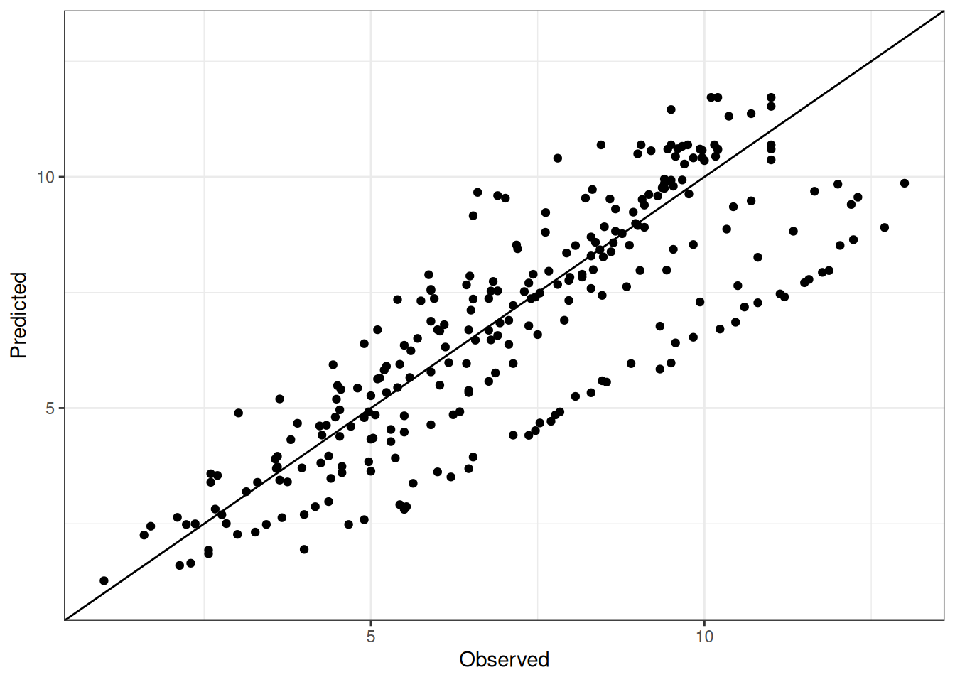
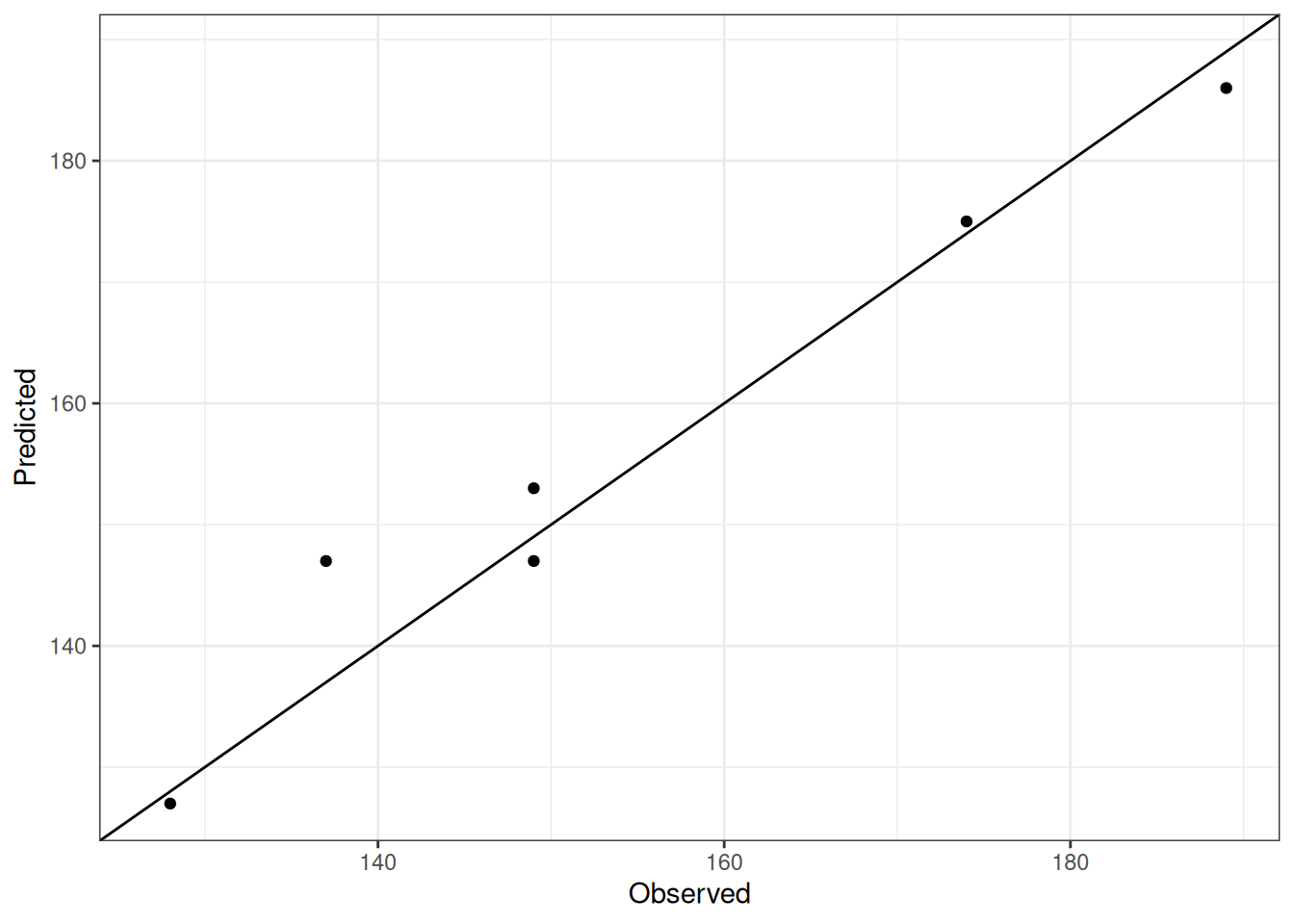
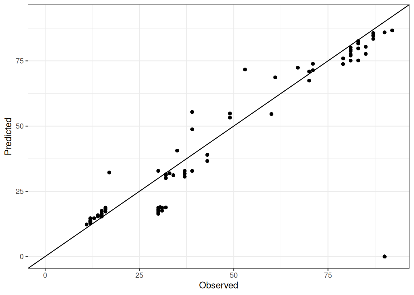
This report is generated for performance of Barley model in APSIM NG for cultivar commander.

Cultivar Information

The cultivar specific parameters used in the simulation are listed in the table below:

Table 1: Cultivar specific parameters for commander
parameter value
[Phenology].MinimumLeafNumber.FixedValue 9
[Phenology].PpSensitivity.FixedValue 3
[Phenology].VrnSensitivity.FixedValue 0
[Phenology].EarlyReproductivePpSensitivity.FixedValue 2
[Structure].BranchMortality.MortalityPhase.Mortality.MortalityPerDegDay.XYPairs.Y 0.001,0

The following aliases are also available for this cultivar: Commander

Experiments

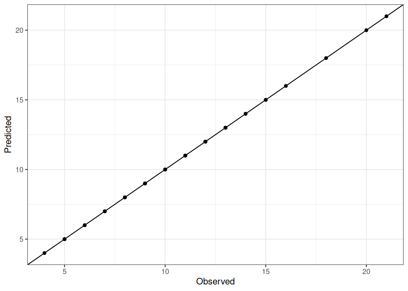
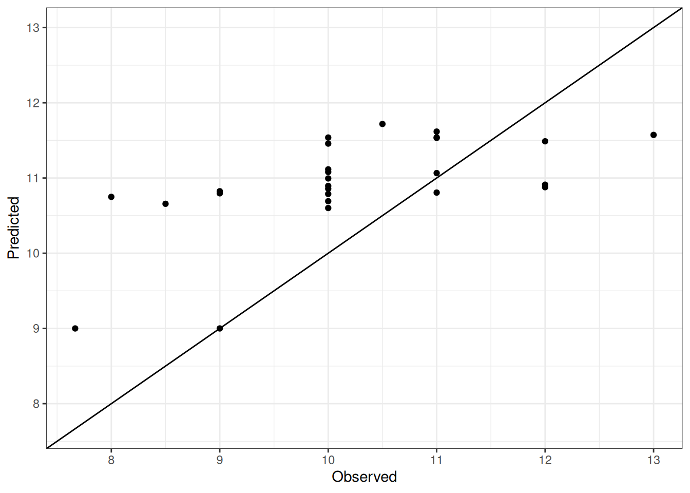
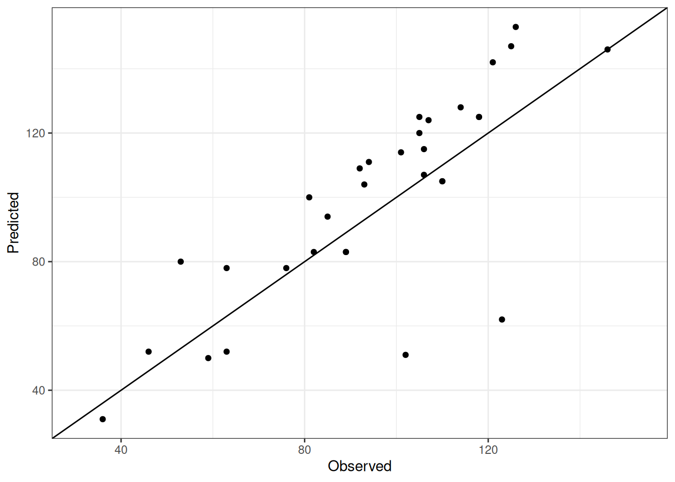
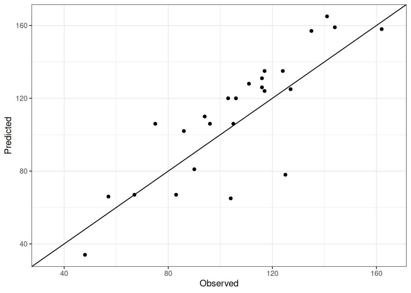
There are 12 experiments which tested cultivar commander in the validation test dataset of APSIM NG. Following the link below to see the details of each experiment, including the observed and predicted values for different traits, and the performance metrics.

Table 2

This map below shows the locations of experiments without controlled environments. Following the link on the marker will take you to the details of each experiment, including the observed and predicted values for different traits, and the performance metrics.

Figure 1: Locations of experiments without controlled environments.

Performance

Overview

The table below summarizes the performance of APSIM NG for cultivar commander across all experiments.

Table 3: Performance summary for cultivar commander across all experiments
trait n r r2 bias mse rmse nrmse d
Phenology.EmergenceDAS 63 1.00 1.00 0.00 0.00 0.00 0.00 1.00
Phenology.FinalLeafNumber 26 0.60 0.36 -0.71 1.49 1.22 0.12 0.65
Phenology.FlagLeafDAS 32 0.80 0.64 -4.31 372.50 19.30 0.20 0.88
Phenology.FloweringDAS 25 0.84 0.71 -4.88 352.64 18.78 0.18 0.90
Phenology.HaunStage 268 0.83 0.69 0.38 2.41 1.55 0.22 0.90
Phenology.MaturityDAS 6 0.98 0.96 -1.50 21.83 4.67 0.03 0.99
Phenology.Zadok.Stage 83 0.57 0.33 9.96 819.00 28.62 0.57 0.77

Comparison of observed and predicted values

The model performance is compared with observed and predicted values for cultivar commander across all experiments. The plots below show the observed vs predicted values for different traits. Each point represents an observation from an experiment. The closer the points are to the diagonal line, the better the performance of the model for that trait.

The range of observed and predicted values are estimated using data in this page, which may be misleading for the narrow ranges of observed and predicted values.

Using the Expand All and Collapse All buttons below, you can expand or collapse the sections for each trait to see the observed vs predicted plots for different traits.

Observed vs Predicted plots for different traits.

Observed vs Predicted plots for different traits.

Observed vs Predicted plots for different traits.

Observed vs Predicted plots for different traits.

Observed vs Predicted plots for different traits.

Observed vs Predicted plots for different traits.

Observed vs Predicted plots for different traits.